
Google has been working on changing the design of the watch video section of the Android and IOS application for YouTube. This happened after the company announced some change earlier. The changes finally rolled out yesterday worldwide.
Repositioned Comments Section
According to Google on its Blog, people engage more in the comments section if it’s in front of them. This is one of the changes Google made in the watch page section. The comment section which earlier was found below the page has now been shifted below the video description.
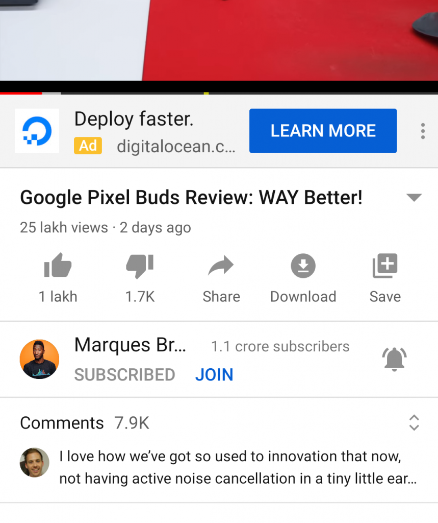
Before, people had to scroll down at the end of the page to comment on the page or see what people are commenting about. Now they can just have a glance at it without scrolling at the bottom.
Youtube says this is going to result in more comments and engagement on the videos of the creators. Comments and likes motivate the creators to create more useful and intuitive content for the viewers and subscribers.
- Advertisement -
Titles In Up next section
Another one of the major changes was seen in the up next section. Earlier we used to have 4 video suggestions on one scroll. Now we can only see two of them. The thumbnail size has been increased.
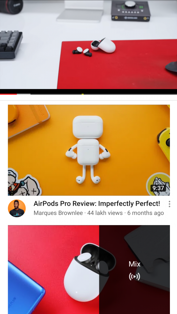
The new up next section seems a lot like the home page of YouTube. The tile arrangement and the thumbnail sizes all resemble the arrangement we see on the homepage of Youtube. This still does not make up for the fact that now the users need to scroll more to have a look at what videos they can watch.
Other Changes
Apart from all this, there is another change spotted in the up next section. The improved Up next section will show community posts from your favorite creators.
This includes text updates, polls, images, GIFs, and more. This is another similar feature that we used to see on the homepage.
This feature along with the channel icon on the Up next section of the new watch page has a unique tint to it which makes it different from the older version. Again people liked having more recommendations but now they can choose from what channel they are viewing from.
- Advertisement -
Also Read Top 5 Youtube to WAV converter to make your life simple